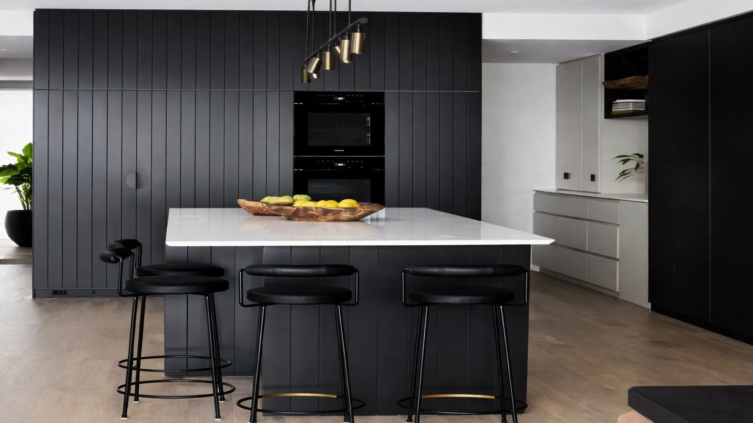
AS JUST ONE PART of a full home renovation, the client’s brief for the kitchen to designer Richelle Langdon of Oliver Myles Interiors reflected the vision for the whole property: create a space that felt inviting without being fussy – a space where family and friends could come together with ease.
“The house is vast and my client wanted to feel warm and grounded in the space. We landed on a refined Australian coastal palette that drew from sandy inlets and banksia pods. There were issues with the flow, so adjustments to the layout resolved functionality, which is the forefront of anything we design,” Richelle says.
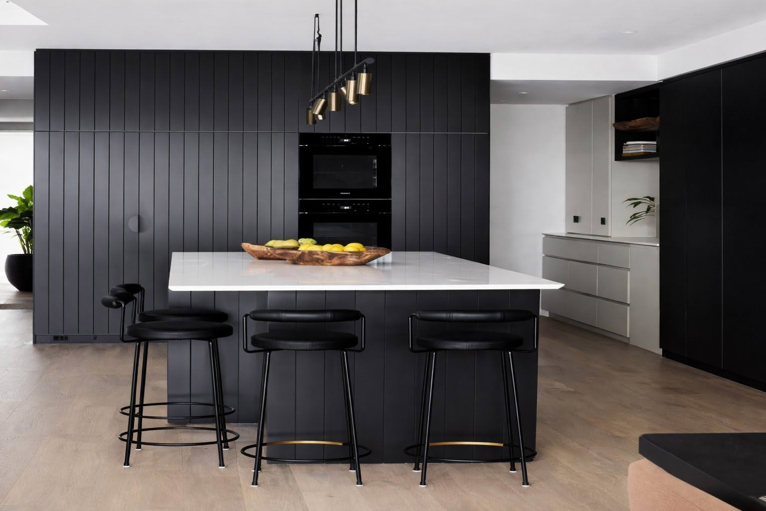
Choosing a colour palette was crucial to creating that sense of being grounded in what is quite a large kitchen footprint. Deep smoky charcoal Resene Double Ironsand is paired with contrasting classic antique off-white Resene Double Thorndon Cream throughout the kitchen for a muted moodiness that feels calming. The ceiling and trim areas are finished with with Resene Eighth Thorndon Cream.
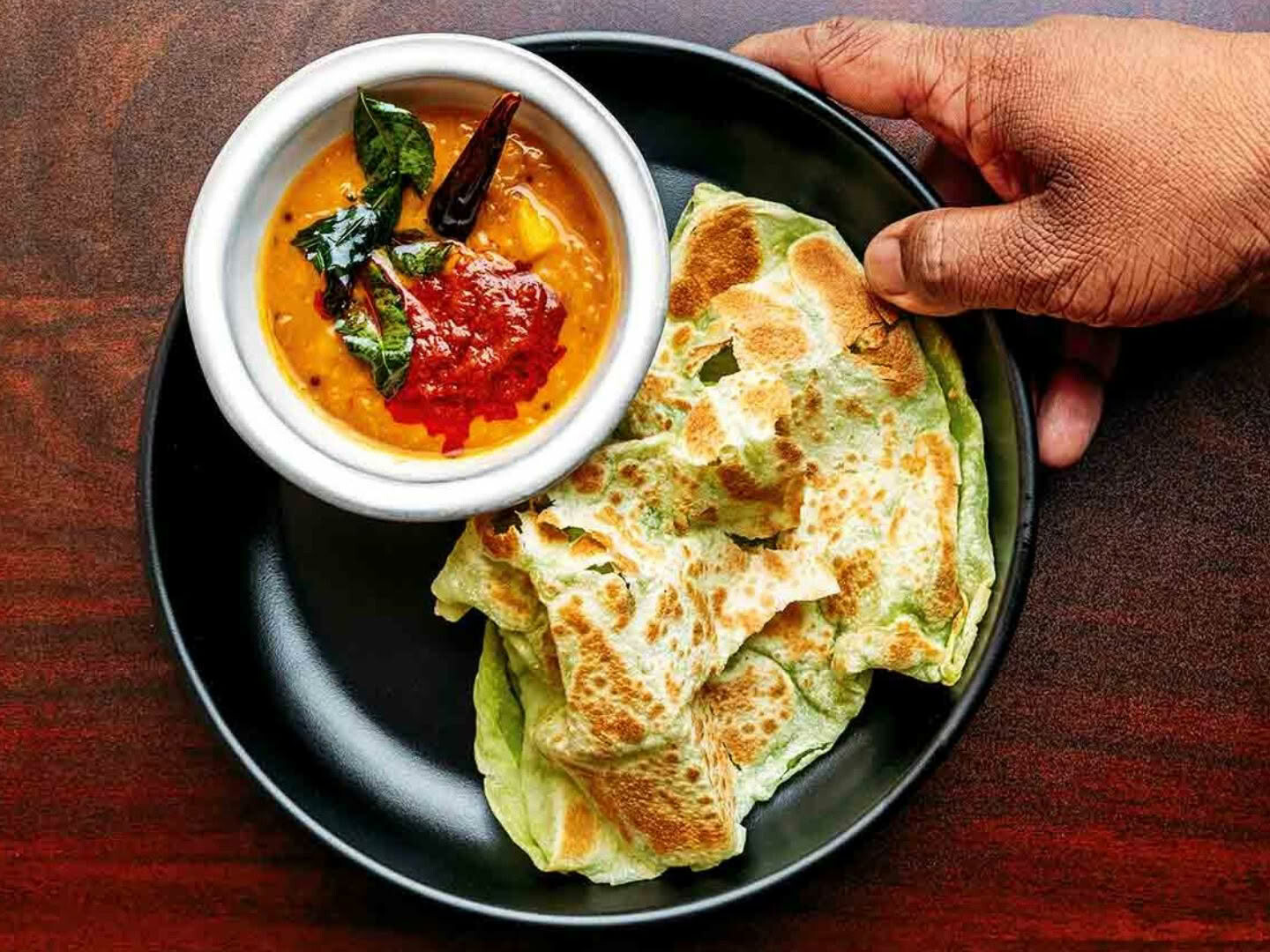
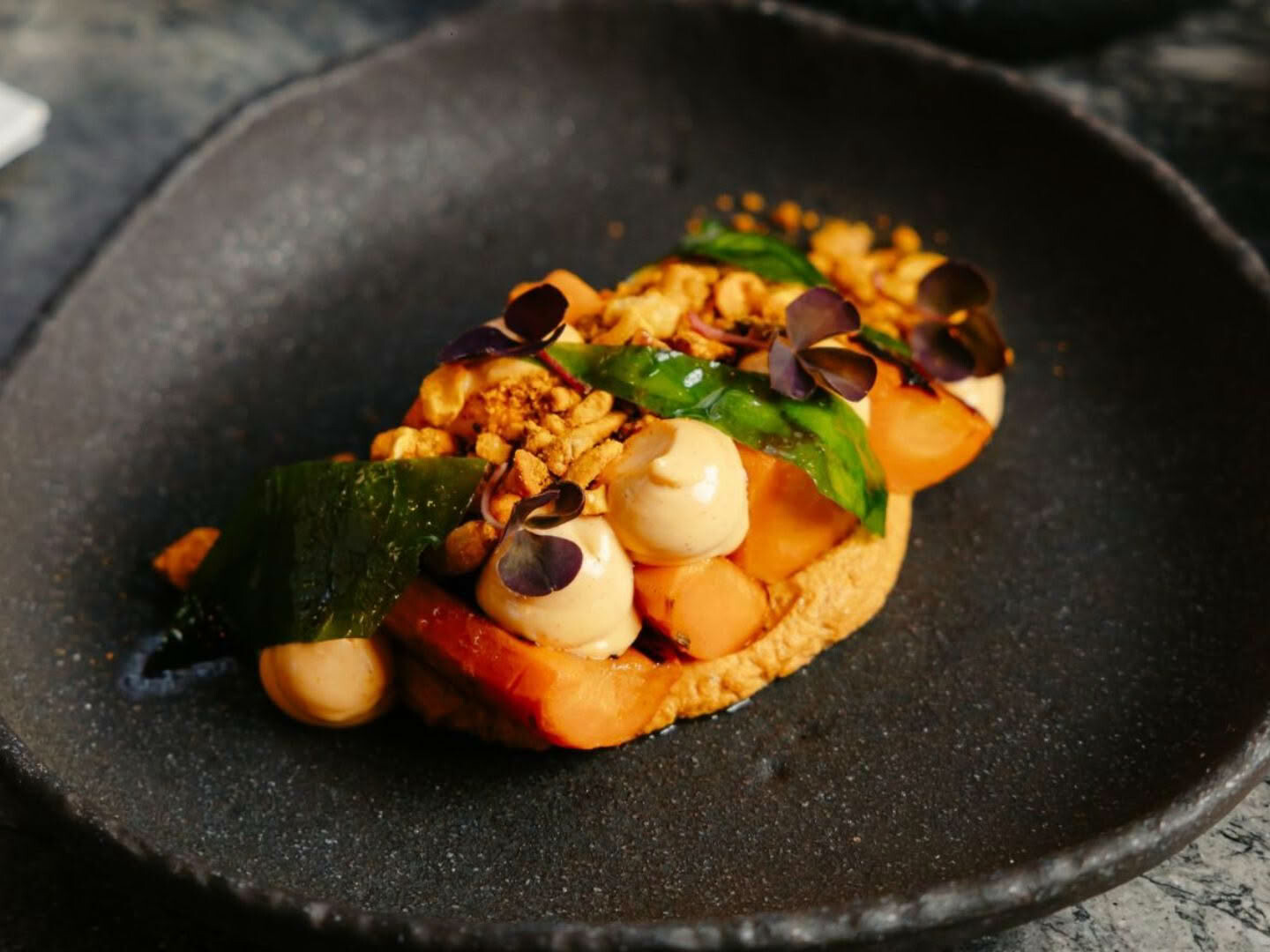
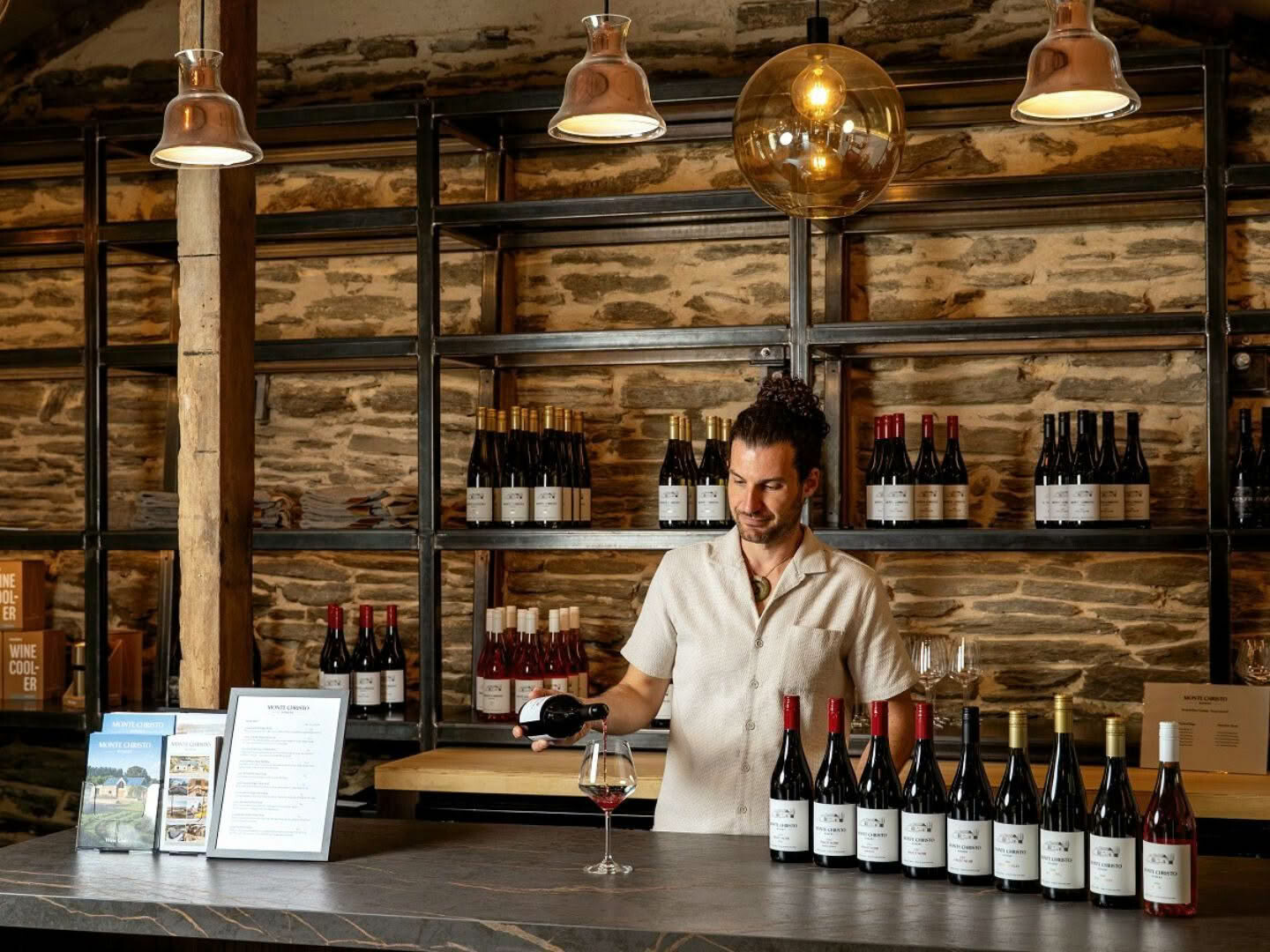
Join us in welcoming our very first six Cuisine TasteCurators in 2025.
“We wanted the space to have some definition or boundaries which is why the island and the tall joinery are in Resene Double Ironsand. It feels strong and cocooning and it pairs well with the light oak floors,” Richelle says.
“This kitchen has no direct natural light so, while it’s not dark, the Resene Double Thorndon Cream provided the perfect lift and a beautifully soft contrast. I love the undertone which pulls out the warmth in the splash back. The off-white combined with the splashback give the space a lovely glow.”
“This base colour palette also provides structure for the material selections made throughout adjoining living and dining. The Resene Eighth Thorndon Cream just adds a crisp clean backdrop to the finished look.”
This yin and yang neutral colour palette also helped soften a change in ceiling height in different parts of the kitchen, Richelle says. “The ceiling drops on the left and right of the back bench. Breaking up the cabinetry with the two colours, bookends the height change and distracts the eye.”
The kitchen’s neutral colour scheme, and the use of v-groove panelling, was also driven by the client’s future plans for the home which meant they didn’t want a polarising palette. “Instead, we created visual interest with colour blocking and texture.”
TOP TIP A semi-gloss finish like Resene Lustacryl is a good choice for doors and trim areas as it’s durable and easy to wipe down. For a higher sheen finish try Resene Enamacryl Gloss.
For more colour ideas and inspiration, visit your local Resene ColorShop, resene.co.nz/colorshops, or view the Resene decorating inspiration gallery online, resene.co.nz/inspirationgallery.
SEE MORE FROM CUISINE